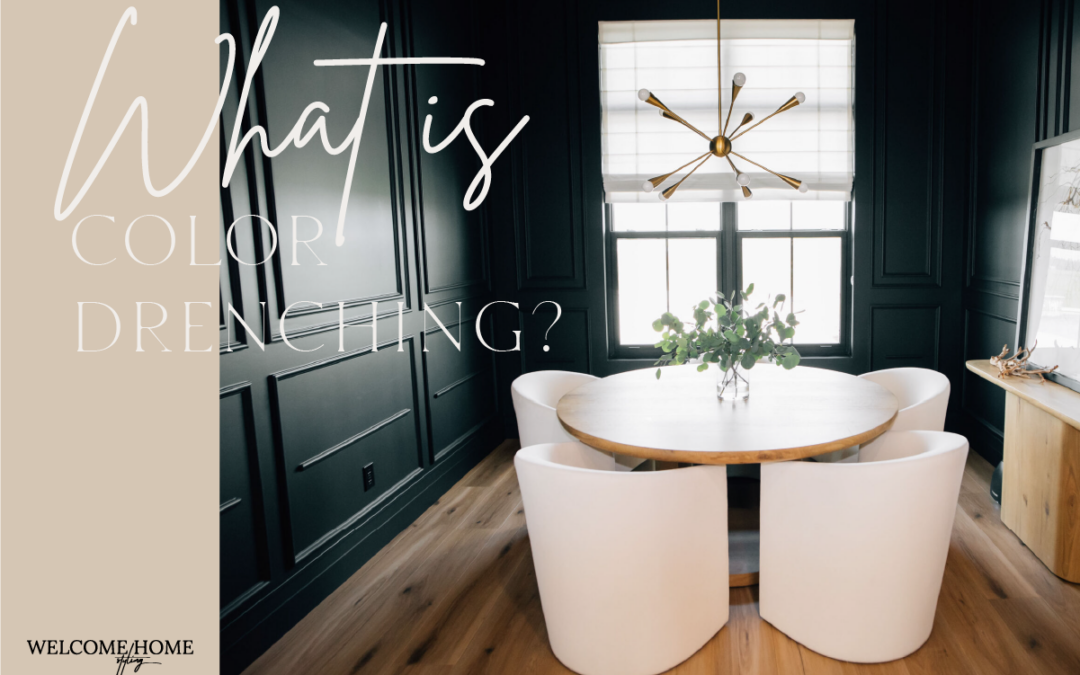
Color drenching is an interior design trend that breaks the traditional pattern of putting color on the walls, white on the ceiling, and white on the trim.
Using a single color, or closely related shades of a single color, throughout a room to create a specific mood, color drenching tells the story of a room from a beautiful, atmospheric point of view. It sets the stage for everything that room means in the life of your household.
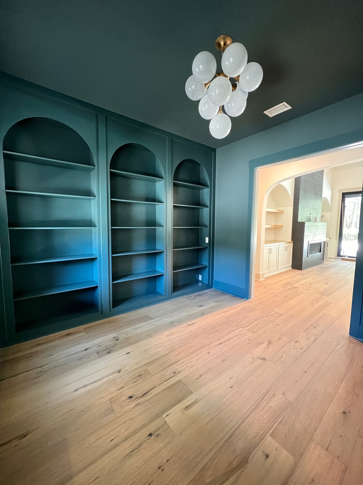
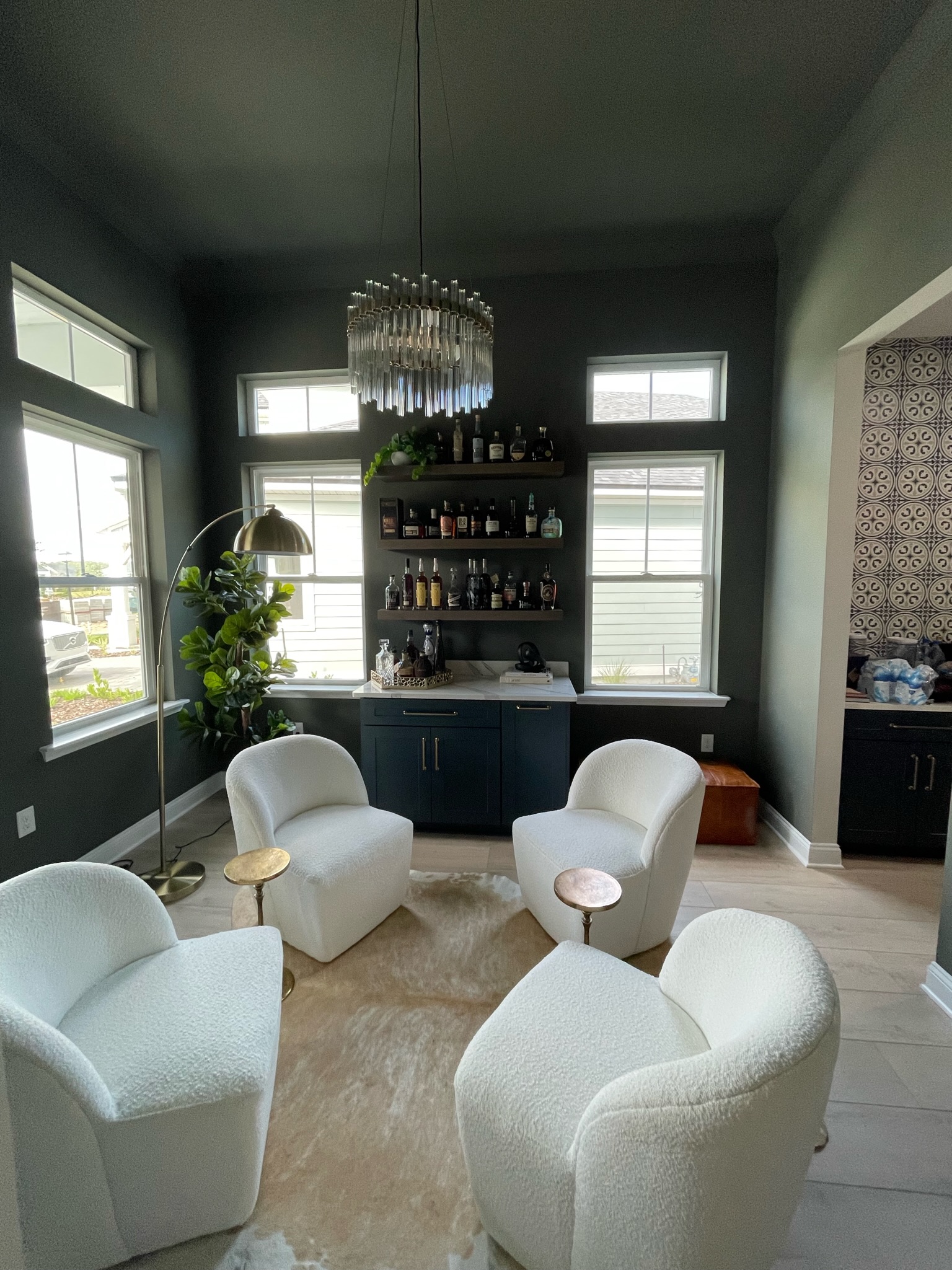
For instance, you might consider a color that sets the stage for relaxing conversation or personal contemplation. Let’s use green as an example. Given their direct connection with nature, various greens are often associated with a comfortable, relaxed atmosphere.
Using a single shade of green and allowing the light that enters the room at different times of day, the character of the room emerges from every corner.
The subtle flow from one area to another adds life to the room without causing the eye to dart about to each separate structure or piece of ornamentation. Instead, you can perceive the room as a whole space dedicated to a specific purpose.
Where stark color contrasts create artificial boundaries for the eyes, color drenching immerses you in a cohesive experience that embraces a single color in all of its facets.
Choosing a Color Is Where the Fun Begins
There’s an entire psychology of color that delves into the various emotions connected with specific colors. Here are some examples:
Entertaining Space: If you want your space to be a lively party venue, consider a base shade of yellow or orange.
Family Room: If you want to enhance the sense of security and trust a family room represents, explore a blue colorway.
Bedroom: This is a great opportunity to enjoy the gentleness associated with the pink family. And yes, you can blend pinks in a way that doesn’t make a room overly feminine.

With that as a starting point, you and Interior Designer Jessica Woodward can move into discussing colors important to you and how they relate to the atmosphere you want in your room.
We used green above as an example, but color drenching can make use of any color that matches the mood you want to create.
It’s fun to explore the entire gamut when it comes to a drenching project: everything from casual, peaceful, gentle pinks to formal, bold, majestic colors like deep blues, or even charcoal gray.
The color cards at your local Sherwin-Williams store are a great place to start!
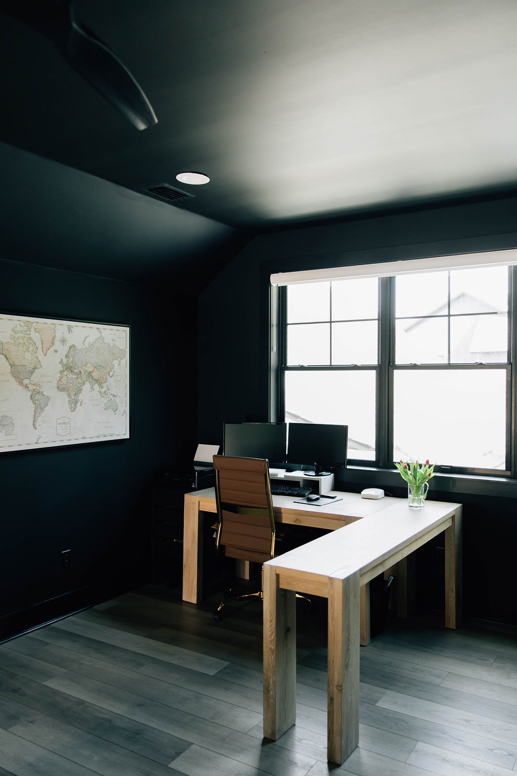
The color-choice stage is where Jessica likes to spend a lot of time in conversation with the client. She’s an interior designer Ponte Vedra homeowners turn to often for guidance with critical decisions.
Sometimes, people become enamored of a color without doing a careful walk-through, assessing how the color fits with the space as a whole, and with the lifestyle the room represents.
Just as Jessica’s relationship with you as a client is key to understanding the goals of your design project, exploring your relationship with a room can help her identify the perfect base color for a drenching design.
The idea of having a relationship with a room can sound foreign to some people, but when you think about it, entering a room should be like running into a friend you’re pleased to see.
Just as each friend in your life calls to mind different shared experiences, each room in your home should speak to a different aspect of your life and personality.
Some general thoughts on potential colors
Go as bold as you feel: If you’re feeling drawn to a strong color like the cobalt blue you often see in pottery, or the comfort-food memories of macaroni-and-cheese yellow, go for it. Just remember that sometimes you have to find the right room for a color rather than using it where it may not be the best choice.
Earthy brings the best of nature inside: Terracotta, clay, rust, and warm browns can make a room cozy. They’re cave-like in a good way: like a hug from Mother Earth.
Neutrals make statements, too: Color drenching is bold, but the color doesn’t have to be. Creams, taupes, and even lighter grays can communicate sophistication while letting architectural features make themselves known subtly and elegantly.
Everything above is intended to be general for purposes of example. The nuances you’ll discover while exploring your project will demonstrate how this bold interior design trend can also express subtle details of your design sense.
Color Drenching a Room Is Beautiful in Its Simplicity
Traditionally, people take a “this color for here, this color for there” approach to painting, but a room doesn’t need a lot of colors to be beautiful.
Color drenching a room follows the contours of a space and lets its features rise out of the colorway with purpose and intentionality.
Drenching Doesn’t Mean Lack of Contrast
When we talk about color drenching a room, we’re talking about not introducing a paint color that strays far from your base tone. We’re not talking about eliminating contrast.
While we can achieve a certain amount of contrast through the use of different shades of the base color, your room will need some stronger contrast to emphasize the overall effect of the drenched atmosphere.
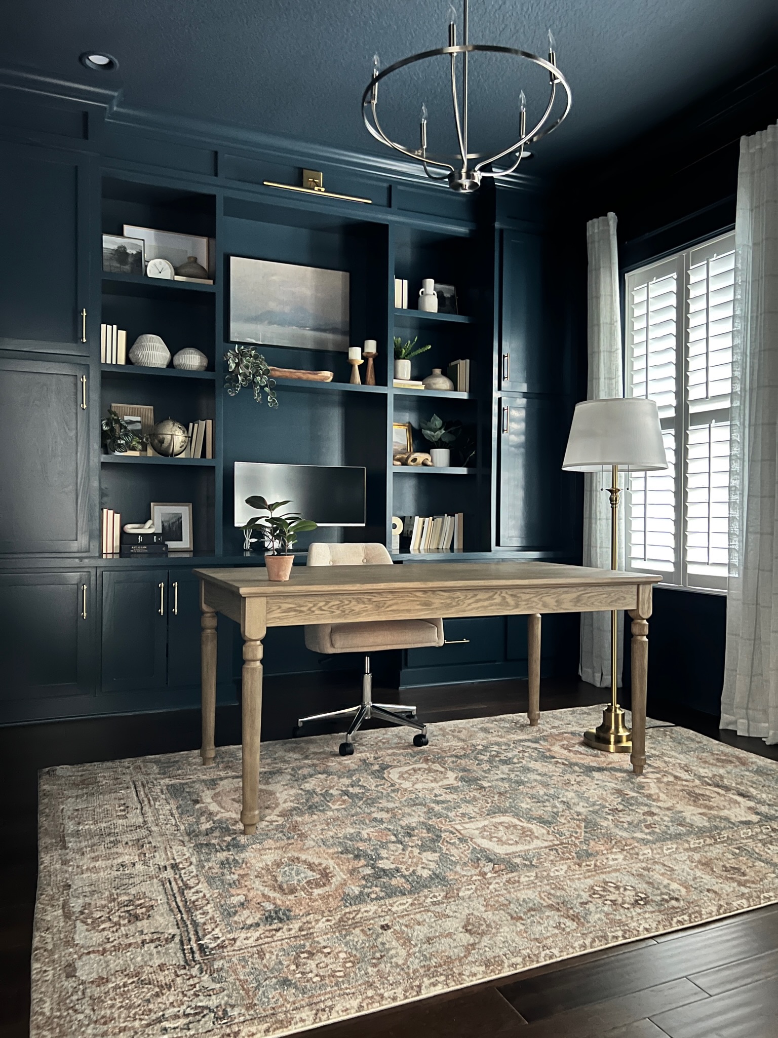
Our interior design company can achieve that in several ways, such as wooden furniture and accents that provide a natural sense of contrast. Metal hardware can provide visual anchor points that don’t compete in terms of color due to their necessary functionality.
Carefully curated artwork is another excellent source of contrast. And it doesn’t need to be large and colorful. Charcoal sketches, pencil sketches, and even black-and-white photography can provide contrast without distracting too much from the room’s colorway.
Color Drenching Is for Ceilings, Too
If you’ve ever gotten lost in the intense beauty of a clear blue sky or marveled at the canopy of green in a forest, you’ve experienced what including your ceiling in a color-drenching strategy can do.
Rather than capping off the color experience, your ceiling can continue it and, in the process, make the room appear larger since there will be no hard lines to stop at when admiring the design.
If you’re color drenching, you’re being intentional. And you don’t need to let your intentionality stop at the ceiling … unless, of course, stopping there is your intention!
Color Drenching Doors and Trim
One of the most important goals of color drenching is achieving a seamless effect throughout a room.
Where doors and trim are traditionally seen as natural seams in a room, color drenching can help them serve that purpose without calling too much attention to themselves.
Doors in particular can be a challenge because, by their very nature, they put a large seam between rooms. They also draw attention to what lies beyond them. Color drenching doors in cohesion with the room emphasizes their role in shutting out the world beyond and providing solitude in the drenched room.
Properly integrated into the drench by an experienced interior design company, doors become structural ornamentation that contributes to occupants’ desire to remain and enjoy the intended atmosphere.
The same goes for trim that serves as ornamentation. Rather than providing a pronounced break in the color scheme, color-drenched trim becomes a landscape feature that adds rolling interest as the eye surveys the room.
If you want your doors and trim to pop a bit, consider a semi-gloss finish that allows them to play with light.
One more thing about trim. If you want a dramatic effect but aren’t ready to go the whole color drenching route, consider filling an entire trimmed wall with color
Thoughts About Room Size
Small rooms can be ideal. Color drenching them can make you reconsider everything you think you know about small rooms.
For instance, the natural instinct for many people is to paint a small room a bright color, attempting to make it feel larger and airier.
But suppose you want that small room to have a more intimate feeling. A dark color provides intimacy while also diminishing any sense of boundaries within the room (again, that seamless quality), allowing you to luxuriate in that intimacy without feeling hemmed in.
You can apply this principle to hallways, foyers, closets, and other small spaces, as well.
Now, let’s consider large spaces. Broad, open-plan floor plans are fairly common in contemporary homes. And the expansive quality of such spaces can make them feel impersonal. Given the multi-purpose aspect of an open floor plan, such a space can also feel visually disconnected.
A strong, uniform color palette can pull together diverse elements in an open floor plan, establishing a shared atmosphere and sense of personality.
The same can be said for a large living room that’s sectioned by furniture groupings that serve different purposes. In such a room, a warm earthy tone across the walls and ceiling can make the space considerably more inviting and avoid having it feel haphazard.
Furniture and Color Drenching
Don’t worry. We’re not going to suggest painting any cherished pieces of fine furniture. Besides, we already covered how woods and metals provide necessary contrast in a color-drenched room.
But if you have the opportunity to add some new, color-palette-friendly furniture pieces to the project, your color drenching can achieve an additional level of impact.
As an example, let’s consider a room drenched in a soft blue.
Adding a sofa and chairs in a slightly deeper blue allows the furniture to rise comfortably out of the colorway, offering visitors an opportunity to literally relax into the palette. The story of the room can then continue with curtains of dusty blue-gray, a rug with blue themes, and pillows that provide other related tones.
By allowing the furniture and accents to further the palette, they don’t disappear into the drench; they enhance it by adding structure to the overall composition.
Lighting Does Wonderful Things
When selecting a color for a drenching project, factor in how light affects the room in the course of a day. For instance, if your room gets a lot of natural light, the changes from dawn to dusk will enhance the atmosphere in various ways.
When nighttime comes, and the light is yours to do with what you will, the atmosphere is under your control and ready for you to get creative. Consider new lighting that will make the most of the color palette you’ve chosen.
Here are a few basic lighting tips:
- Warm lighting is great for reds, browns, creams, and warm greens.
- Cooler lighting works well with blue and gray tones.
- A matte paint finish absorbs light, creating a soft and sophisticated ambiance.
- Satin and eggshell finishes reflect more light and can emphasize architectural details.
- Glossy finishes should be used sparingly, as they reflect a lot of light and will greatly emphasize whatever you put them on; consider semi-gloss for a less bold emphasis. Consider a matte finish for walls and a satin finish for trim/millwork.
Avoid Common Color Drenching Mistakes
Color drenching can be a deceptive technique. It sounds simple, but a few easy-to-make mistakes can undermine your project.
Don’t choose a color without testing it: Check any color you intend to use against your flooring, your furniture, the natural light in your room, and any artificial light you have in the space.
Don’t use the same paint finish everywhere: As we mentioned earlier, even a color-drenched room needs contrast. A single paint finish throughout a room can diminish any sense of energy unique to the room.
Don’t ignore what you’re not painting: Flooring, stone surfaces, finely crafted woodwork, and furniture can all influence your final result.
Don’t overdo competing colors: People will sometimes try too hard for contrast by adding too much additional color in the form of art and accents.
Does Color Drenching Suit Your Home?
If there’s one thing certain about color drenching, it’s this: the technique is versatile.
If you like the concept, you can very likely find a way to use it.
It’s your house, after all. If a room in a single color speaks to you, you should have it:
- Go all the way and do a single, saturated color everywhere if you’re sure that’s what you want (just remember what we said earlier about varying your finishes).
- Take a less bold approach and use closely related shades of a base color throughout the room.
- If you’re nervous, start somewhere small, like a powder room, hallway, reading nook, or home office. If you love it there, you may be inspired to try a larger space.
The most important thing is to choose a color you love and that you’ll enjoy living with, one that will bring you consistent pleasure.
Where Is This Interior Design Trend Going?
The role of color in interior design is a story that will never end. Trends like color drenching are like chapters in that story.
Right now, color drenching is garnering a lot of attention as part of a larger story about a shift toward more expressive and atmospheric spaces.
Where white walls, neutral furnishings, and carefully controlled accents were once the order of the day, and are still quite popular, homeowners seeking individuality are growing more and more fond of interiors that make a statement.
Color drenching allows a bold statement without the expense and distraction of various layers of decoration. It enhances the architectural elements of a room and creates a deliberate, intentional, emotionally engaging atmosphere.
Here’s another way to look at it. Color drenching isn’t simply about paint as a wall covering. It uses paint as an architectural material that becomes the wall rather than simply decorating it.
Color drenching can highlight structure. It can create a sense of expansive continuity in a room that might otherwise feel disjointed and congested. It can even define a mood.
In short, the versatility of color drenching is sure to give it a long life in the world of design trends. And we’re here to help you explore what it can do in your home!